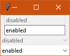
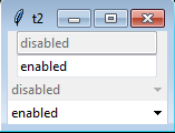
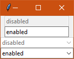
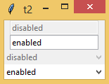
| Ticket UUID: | 05bd7f4da8eef76d964034a9b869513d5c113072 | |||
| Title: | vista theme: combobox does not have disabled background | |||
| Type: | Bug | Version: | 8.6.8 | |
| Submitter: | bll | Created on: | 2018-07-31 17:28:10 | |
| Subsystem: | 02. Appearance | Assigned To: | fvogel | |
| Priority: | 5 Medium | Severity: | Minor | |
| Status: | Closed | Last Modified: | 2018-09-07 20:42:34 | |
| Resolution: | Fixed | Closed By: | fvogel | |
| Closed on: | 2018-09-07 20:42:34 | |||
| Description: |
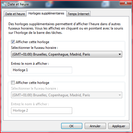
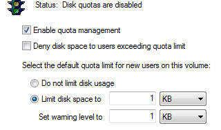
A standard windows disabled combobox can be found at:
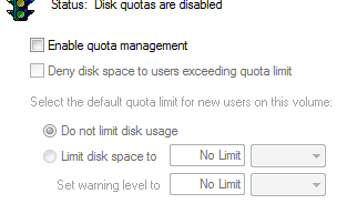
right-clicking on C:\, properties, quota, show quota settings

A possible patch:

bll-tecra:bll$ diff -uw vistaTheme.tcl /home/bll/vbox_shared/vistaTheme.tcl
--- vistaTheme.tcl      2018-07-31 09:30:57.389154895 -0700
+++ /home/bll/vbox_shared/vistaTheme.tcl        2018-07-31 10:23:24.995589247 -0700
@@ -56,6 +56,8 @@

         # Combobox
        ttk::style configure TCombobox -padding 2
+        ttk::style element create Combobox.background vsapi \
+            EDIT 3 {disabled 3 {} 0}
         ttk::style element create Combobox.field vsapi \
             COMBOBOX 2 {{} 1}
         ttk::style element create Combobox.border vsapi \
@@ -65,12 +67,14 @@
             -syssize {SM_CXVSCROLL SM_CYVSCROLL}
         ttk::style layout TCombobox {
             Combobox.border -sticky nswe -border 0 -children {
-                Combobox.rightdownarrow -side right -sticky ns
+               Combobox.background  -sticky nswe -children {
                 Combobox.padding -expand 1 -sticky nswe -children {
                     Combobox.focus -expand 1 -sticky nswe -children {
                         Combobox.textarea -sticky nswe
                     }
                 }
+                  Combobox.rightdownarrow -side right -sticky ns
+                }
             }
         }
         # Vista.Combobox droplist frame
| |||
| User Comments: |
fvogel added on 2018-09-07 20:42:34:
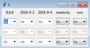
Merged to core-8-6-branch and trunk. bll added on 2018-09-06 20:40:52: I know what you mean, I had seen that in one iteration. I still like the readonly version from the wiki better (wro in the picture). That's what I am using in my application. I just leave out the focus entirely. The later readonly version has the look of a frame around it. And I don't like what the focus ring does to it. I think this ticket can be closed. I just wanted to double check the look one more time as you had made more changes. fvogel added on 2018-09-06 20:21:15: The previous one had a bug: when using the keyboard to traverse widgets, the editable combobox in readonly state became blank. Try this:
    package require Tk
    ttk::style theme use vista
    set ::x disabled
    set ::y enabled
    set ::z readonly
    pack [ttk::entry .e -state disabled  -textvariable ::x]
    pack [ttk::entry .e2 -textvariable ::y]
    pack [ttk::entry .e3 -state readonly  -textvariable ::z]
    pack [ttk::combobox .cb -state disabled -values disabled -textvariable ::x]
    pack [ttk::combobox .cb2 -values enabled -textvariable ::y]
    pack [ttk::combobox .cb3 -state readonly  -textvariable ::z]
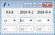
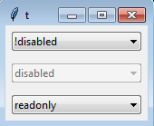
now click in the entry to give it the focus. Finally hit the TAB key until you reach the readonly combobox --> it becomes blank. The latest iteration does not have this problem. bll added on 2018-09-06 20:12:24: Attached a image with comparison of the old vs. the two newer iterations of the combobox on windows 7. On windows 7, I cannot see any difference between the two iterations that were made. They both look good. fvogel added on 2018-09-04 21:58:16: Editable-looking combobox I have now committed an even better version since my proposal on 2018-09-02 still had a bug (when using the keyboard to traverse widgets, the editable combobox in readonly state became blank). See this improved version [2381692363]. This has no issue I can find using the following two scriptlets:
    package require Tk
    ttk::style theme use vista
    set ::x disabled
    set ::y enabled
    set ::z readonly
    pack [ttk::entry .e -state disabled  -textvariable ::x]
    pack [ttk::entry .e2 -textvariable ::y]
    pack [ttk::entry .e3 -state readonly  -textvariable ::z]
    pack [ttk::combobox .cb -state disabled -values disabled -textvariable ::x]
    pack [ttk::combobox .cb2 -values enabled -textvariable ::y]
    pack [ttk::combobox .cb3 -state readonly  -textvariable ::z]

    package require Tk
    ttk::style theme use vista
    set v [list !disabled disabled readonly]
    foreach {s} [list !disabled disabled readonly] {
      set ::v$s $s
      ttk::combobox .cb$s -values $v -textvariable ::v$s -state $s
      pack .cb$s -pady 5p -padx 5p
    }
I kept the readonly 5 as agreed for the combobox, and didn't change the readonly 3 for the entry. Readonly-looking combobox Thanks for having put this on the wiki, I fully agree it should not be committed at this point. The following I believe addresses the last remaining issue of the missing focus ring:
        # Combobox
	ttk::style configure TCombobox -padding 2
        ttk::style element create Combobox.background vsapi \
            COMBOBOX 5 {disabled 4 pressed 3 active 2 hover 2 {} 1}
        ttk::style element create Combobox.border vsapi \
            COMBOBOX 4 {disabled 4 focus 3 active 2 hover 2 {} 1}
        ttk::style element create Combobox.rightdownarrow vsapi \
            COMBOBOX 6 {disabled 4 pressed 3 active 2 {} 1} \
            -syssize {SM_CXVSCROLL SM_CYVSCROLL}
        ttk::style layout TCombobox {
            Combobox.border -sticky nswe -border 0 -children {
                Combobox.padding -expand 1 -sticky nswe -children {
                    Combobox.background -sticky nswe -children {
                        Combobox.rightdownarrow -side right -sticky ns
                        Combobox.focus -expand 1 -sticky nswe -children {
                            Combobox.textarea -sticky nswe
                        }
                    }
                }
            }
        }
For me this closes the work on this ticket. bll added on 2018-09-03 14:42:41: 1. Looks good. 2. I think the readonly 5 is fine here. 3. Edit box: I think the readonly 3 was on purpose. It makes it clear that the edit box cannot be modified. So I would leave that as is. Both grey, but the readonly edit box keeps the sunken relief, whereas disabled is flat, so there is a distinction. Readonly: Here is the wiki page I created for the readonly combobox in case anyone else reads this. https://wiki.tcl-lang.org/55506 bll added on 2018-09-02 21:08:53: Some quick answers. I will review thoroughly this evening perhaps. 1. Agreed. I think the grey background is better than the windows default with the white. 2, 3. Will review later. Readonly It is missing the windows focus ring. I put it on the wiki for people to use if they want to. It requires some code for non vista themes. I do not think it should be committed. There cannot be two separate styles in use at the same time. Documented, yes. Left out yes. fvogel added on 2018-09-02 20:24:28: Summing up (an attempt, at least): Editable combobox:
Readonly combobox:
bll added on 2018-08-28 12:53:55: Comparing against the original, it is no different and the border color is wrong. And there's still no grey-ish background for disabled. bll added on 2018-08-28 12:39:54: It looks really good except that the border color around the combobox is grey instead of blue. I don't know why that would be, perhaps ttk is overriding it somewhere (or I am overriding it somehow? I'm testing within my application right now, it's not pure). I still want to figure out the layout for a readonly combbox widget with the focus fixed. bll added on 2018-08-28 12:32:47:
This is very close to the editable combobox.
I was trying to figure out how to replace/fix Combobox.focus for the
readonly layout and was playing around with CP_TRANSPARENTBACKGROUND.

  CBTBS_NORMAL 1
  CBTBS_HOT 2
  CBTBS_DISABLED 3
  CBTBS_FOCUSED 4

    ttk::style layout TCombobox {
      ttk::style element create Combobox.field vsapi \
          COMBOBOX 5 {disabled 4 focus 3 pressed 3 active 2 hover 2 {} 1}
      ttk::style element create Combobox.border vsapi \
          COMBOBOX 4 {disabled 4 focus 3 active 2 hover 2 {} 1}
      ttk::style element create Combobox.rightdownarrow vsapi \
          COMBOBOX 6 {disabled 4 pressed 3 active 2 {} 1} \
          -syssize {SM_CXVSCROLL SM_CYVSCROLL}
      ttk::style element create Combobox.tbackground vsapi \
          COMBOBOX 3 {disabled 3 focus 4 active 2 hover 2 {} 1}
      ttk::style layout TCombobox {
          Combobox.border -sticky nswe -border 0 -children {
              Combobox.tbackground -sticky nswe -children {
                  Combobox.rightdownarrow -side right -sticky ns
                  Combobox.padding -expand 1 -sticky nswe -children {
                    Combobox.focus -expand 1 -sticky nswe -children {
                      Combobox.textarea -sticky nswe
                    }
                  }
              }
          }
      }
   }
bll added on 2018-08-28 12:08:16: I was just thinking... Since it's not possible to support two different styles for a single widget, the style improvements for the readonly combobox you have done should be preserved. I would add it as a new style to vistaTheme.tcl named TReadonlyCombobox (suggestion). The readonly combobox elements will have to have different names, of course. I am right now adding this new style to my application. Going to try it out for my readonly comboboxes. It is not quite this simple unfortunately, as the same style needs to be set up for all other themes: ttk::style layout TReadonlyCombobox [ttk::style layout TCombobox] It's almost perfect. The readonly combobox focus element needs to be replaced also. bll added on 2018-08-26 20:05:20: Start -> Run (mine doesn't have anything but a big empty box for the drop-down). Start -> Run, then select Browse. The file chooser has a editable combobox for the "File Name" near the bottom of the window. So I guess windows does have them. Not sure how to find a disabled version. fvogel added on 2018-08-26 19:17:53: Yes I see what you mean. This is due to my using of a CP_READONLY element. Note that, whatever the visual rendering hints, the user actually can enter text in the !disabled state as expected. I'm inclined to think your remark is valid, however are you 100% sure that this is not the expected rendering for !disabled on Vista? I couldn't find an example of such an editable combobox in the OS itself, could you point me to such widget from any Vista-native dialog (or later version of Windows perhaps)? Using CP_BACKGROUND instead of CP_READONLY will let the user think he can enter text in the combobox (white background), but then we're back to the original issue that the background of the combobox is still white even in disabled mode. This is becasue vsstyle.h does not define states for CP_BACKGROUND. I don't know how to achieve the desired effect without using elements that do not belong to the COMBOBOXPARTS. Using a background element from EDITPARTS (i.e. using EP_BACKGROUND) as you originally proposed in your patch, could perhaps be possible, but then the readonly combobox does not look native. bll added on 2018-08-25 15:58:24: Test script:
package require Tk
set v [list !disabled disabled readonly]
foreach {s} [list !disabled disabled readonly] {
set ::v$s $s
ttk::combobox .cb$s -values $v -textvariable ::v$s -state $s
pack .cb$s -pady 5p -padx 5p
}
Testing on windows 7:
It looks nice as a combobox, but it no longer looks like something that
can be typed into. It still needs to be clear that in the normal state
there can be text entry.
fvogel added on 2018-08-24 19:35:42: Also now managing the HOT state when the mouse hovers the combobox, as it happens on a real Vista box, see [1636823a9b]. Definitely looking more native. Opinions and test results for other platforms than Vista more than welcome. fvogel added on 2018-08-24 19:21:28: I believe I have the correct fix [c092ee42ca] and, quite importantly, I understand it. The combobox now looks definitely (more) native with vista theme, in all normal, disabled and pressed states. Compare to the attached snapshot of the combobox on vista ("Normal and disabled native combobox on vista.png"). I could only try on Vista, could you provide results on other Windows version as you did previously? Thanks! fvogel added on 2018-08-23 20:35:40: The answer from Pat Thoyts in this thread is even more worth reading. It deals specifically with the present problem we are struggling with. fvogel added on 2018-08-21 20:52:41: I found something worth reading, IMO, it is full of explanations and gotchas as well. There is a little tool "ThemeExplorer" which provides insight, I tried it. bll added on 2018-08-21 16:18:50: I think the change should be ok, since the default state is EBS_NORMAL
(the {} 1) portion. It looks like CP_BACKGROUND has no states associated
with it at all.
For that matter, vistaTheme.tcl is defining Combobox.field, but
it is not used in the layout(!). Commenting it out seems to not cause
any issues. This is the same for many layouts throughout the file.
The .textarea elements are not specifically defined in vistaTheme.tcl.
But it appears they cannot be re-defined. They must be in the C language
portion of the code.
bll added on 2018-08-21 15:56:18: Still doesn't work without the additional background field. It will need additional testing to make sure the change does not interfere with focus, hover, pressed, active states. bll added on 2018-08-21 15:45:58: Since CBB_DISABLED is 4, maybe try your change with:
+ COMBOBOX 2 {disabled 4 {} 1}
???
Extractor:
#!/home/bll/local-64/bin/tclsh86
#
#
# this is written using the include file from mingw64 (msys2).
# changes will be necessary to support the include files from
# windows VC.
# have to specify the windows path, not the msys2 path
set infile c:/msys64/mingw64/x86_64-w64-mingw32/include/vsstyle.h
set fh [open $infile r]
set inpart 0
set instate 0
set parts [dict create]
set states [dict create]
while { [gets $fh line] >= 0 } {
if { $inpart || $instate } {
if { [regexp {^\s+([A-Z0-9_]+)\s+=\s+(\d+)} $line all var val] } {
if { $inpart } {
dict set parts $var $val
}
if { $instate } {
dict set states $var $val
}
} elseif { [regexp "^\\s*\};" $line] } {
set inpart 0
set instate 0
}
}
if { [regexp "^enum\\s+(\[A-Z_\]+PARTS)\\s+\{" $line all nm] } {
set inpart 1
}
if { [regexp "^enum\\s+(\[A-Z_\]+STATES)\\s+\{" $line all nm] } {
set instate 1
}
}
puts "array set ::vsapi::parts {"
dict for {var val} $parts {
puts " $var $val"
}
puts "}"
puts "array set ::vsapi::states {"
dict for {var val} $states {
puts " $var $val"
}
puts "}"
close $fh
exit 0
bll added on 2018-08-21 15:14:27: We need a VS API expert to document it.
There is also:
https://docs.microsoft.com/en-us/windows/desktop/controls/aero-style-classes-parts-and-states
Perhaps a VS API expert can tell us whether the aero-style parts and states
can be used, should we be using them, what happens if we use them on a
non-aero enable system, etc. etc.
I'd like to see:
array set ::vsapiparts {
CP_DROPDOWNBUTTON 1
CP_BACKGROUND 2
CP_TRANSPARENTBACKGROUND 3
CP_BORDER 4
CP_READONLY 5
CP_DROPDOWNBUTTONRIGHT 6
CP_DROPDOWNBUTTONLEFT 7
CP_CUEBANNER 8
...
}
and
array set ::vsapistates {
CBB_DISABLED something
...
}
This could probably be automated from an appropriate header file.
fvogel added on 2018-08-19 21:43:11: From a very careful reading of the documentation: In ttk_vsapi.n: -
- "className and partId are required parameters and specify the Visual Styles class and part as given in the Microsoft documentation." The "Microsoft documentation" on the internet leads to the className and partId be defined in vssym32.h I believe. The mapping between the enums in vsstyle.h and class names used in, say, vistaTheme.tcl seems to be documented here. For instance, a COMBOBOX (vistaTheme.tcl) class name has (from the MS doc and from vsstyle.h) the following part names with their associated ids:
enum COMBOBOXPARTS {
	CP_DROPDOWNBUTTON = 1,
	CP_BACKGROUND = 2,
	CP_TRANSPARENTBACKGROUND = 3,
	CP_BORDER = 4,
	CP_READONLY = 5,
	CP_DROPDOWNBUTTONRIGHT = 6,
	CP_DROPDOWNBUTTONLEFT = 7,
	CP_CUEBANNER = 8,
};
So, with this knowledge in mind, the following patch (on top of the bugfix branch) should achieve the desired result:
Index: library/ttk/vistaTheme.tcl
==================================================================
--- library/ttk/vistaTheme.tcl
+++ library/ttk/vistaTheme.tcl
@@ -59,27 +59,23 @@

        ttk::style configure Toolbutton -padding {4 4}

         # Combobox
        ttk::style configure TCombobox -padding 2
-        ttk::style element create Combobox.background vsapi \
-            EDIT 3 {disabled 3 {} 1}
         ttk::style element create Combobox.field vsapi \
-            COMBOBOX 2 {{} 1}
+            COMBOBOX 2 {disabled 3 {} 1}
         ttk::style element create Combobox.border vsapi \
             COMBOBOX 4 {disabled 4 focus 3 active 2 hover 2 {} 1}
         ttk::style element create Combobox.rightdownarrow vsapi \
             COMBOBOX 6 {disabled 4 pressed 3 active 2 {} 1} \
             -syssize {SM_CXVSCROLL SM_CYVSCROLL}
         ttk::style layout TCombobox {
             Combobox.border -sticky nswe -border 0 -children {
                 Combobox.rightdownarrow -side right -sticky ns
-                Combobox.background -sticky nswe -children {
-                    Combobox.padding -expand 1 -sticky nswe -children {
-                        Combobox.focus -expand 1 -sticky nswe -children {
-                            Combobox.textarea -sticky nswe
-                        }
+                Combobox.padding -expand 1 -sticky nswe -children {
+                    Combobox.focus -expand 1 -sticky nswe -children {
+                        Combobox.textarea -sticky nswe
                     }
                 }
             }
         }
         # Vista.Combobox droplist frame
Unfortunately this does not work, which shows there is still some bits that I do not grasp. When we will be understanding this a bit more, perhaps all this information could be dumped in some Tcler's wiki page, feel free to do so if you wish? bll added on 2018-08-05 14:38:26: I wish I understood it better. - Why is Spinbox.field labeled as 'EDIT 9', but Combobox.field as 'COMBOBOX 2'? - Are those labels, COMBOBOX, EDIT, SPIN, something that gets passed to the VS API? Or used internally by ttk? - What do all those damned numbers mean? Those should be defined in an array so that they have names. fvogel added on 2018-08-05 06:59:42: I have updated the code in the bugfix branch, thanks. The geometry change indeed gets reverted by swapping the calls. The rendered result does not seem to change with "{} 1" as default state for the state map. The snapshots you gave seem to prove that the change is woring on all flavours of Windows. Before merging I should probably better understand the patch. bll added on 2018-08-04 17:01:50: Updated win 7 attachments with latest. Attached win 8.1 and win 10 pictures. bll added on 2018-08-04 16:23:53: - No geometry change was intended.
This can be fixed by moving the Combobox.rightdownarrow back up
above Combobox.padding where it was before.
Apparently the ttk::style layout process is rather sensitive.
- I am rather clueless about windows programming and the VS API.
I don't understand it at all, and have no idea what all those
numbers mean. (Why didn't the original programmer create
some constants?). I just looked at ttk::entry and ttk::spinbox
layouts and futzed around until something worked. I have no
idea how that 0 crept in, as I should have just copy/pasted
from ttk::spinbox. Reason has left the room.
# Combobox
ttk::style configure TCombobox -padding 2
ttk::style element create Combobox.background vsapi \
EDIT 3 {disabled 3 {} 1}
ttk::style element create Combobox.field vsapi \
COMBOBOX 2 {{} 1}
ttk::style element create Combobox.border vsapi \
COMBOBOX 4 {disabled 4 focus 3 active 2 hover 2 {} 1}
ttk::style element create Combobox.rightdownarrow vsapi \
COMBOBOX 6 {disabled 4 pressed 3 active 2 {} 1} \
-syssize {SM_CXVSCROLL SM_CYVSCROLL}
ttk::style layout TCombobox {
Combobox.border -sticky nswe -border 0 -children {
Combobox.background -sticky nswe -children {
Combobox.rightdownarrow -side right -sticky ns
Combobox.padding -expand 1 -sticky nswe -children {
Combobox.focus -expand 1 -sticky nswe -children {
Combobox.textarea -sticky nswe
}
}
}
}
}
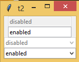
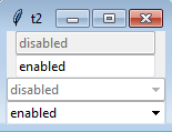
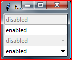
fvogel added on 2018-08-04 13:21:22: I understand better the context now, thanks. I have committed your patch in a bugfix branch for easy review and testing. Indeed it shows now a greyed out background for disabled comboboxes. At this point I'm questioning two things in the patch: a. There is a geometry change between before and after the patch. Is this intended? Easy checking (with two entry boxes for comparison of the width): package require Tk ttk::style theme use vista set ::x disabled set ::y enabled pack [ttk::entry .e -state disabled -textvariable ::x] pack [ttk::entry .e2 -textvariable ::y] pack [ttk::combobox .cb -state disabled -values disabled -textvariable ::x] pack [ttk::combobox .cb2 -values enabled -textvariable ::y] b. The state map you propose is Generally speaking, could you explain the reasoning behind this patch (since this area of ttk is rather complicated for me, and I'm not sure to grasp the complete implications). How did you come up with these changes? Did you draw inspiration from some other code perhaps? bll added on 2018-08-03 21:06:06: The quotas example obviously is not very good. A standard ttk::entry box or ttk::spinbox is a better example. bll added on 2018-08-03 20:57:35: package require Tk ttk::style theme use vista set ::x disabled pack [ttk::combobox .cb -state disabled -values disabled -textvariable ::x] set ::y enabled pack [ttk::combobox .cb2 -values enabled -textvariable ::y] bll added on 2018-08-03 20:56:32: Should have puts this in before: Reference: https://wiki.tcl-lang.org/15780 Andy was complaining, so this is my attempt to fix it. I have not tested on anything other than windows 7. It needs to be tested on Vista (which you have), 7, 8.1, 10. fvogel added on 2018-08-03 20:34:16: I tried your patch but cannot see any difference with and without the patch by simply running: package require Tk ttk::style theme use vista pack [ttk::combobox .cb -state disabled] Also I don't see obvious differences between the standard Windows disabled combobox from the "Quotas" OS dialog (on Vista) and what my script above shows. Could you please provide a demo script, explain what is currently incorrect in the rendering of the ttk::combobox and how the patch fixes those issues? | |||
Attachments:
- img-cbox-win7-2018-9-6-B.png [download] added by bll on 2018-09-06 20:36:32. [details]
- img-cbox-win7-2018-9-6.png [download] added by bll on 2018-09-06 20:10:44. [details]
- win7-20180825.png [download] added by bll on 2018-08-25 15:58:42. [details]
- Normal and disabled native combobox on vista.png [download] added by fvogel on 2018-08-24 19:21:41. [details]
- win10-with-patch.PNG [download] added by bll on 2018-08-04 17:09:02. [details]
- win7-with-patch.png [download] added by bll on 2018-08-04 17:08:49. [details]
- win10-without-patch.PNG [download] added by bll on 2018-08-04 17:00:43. [details]
- win81-with-patch.png [download] added by bll on 2018-08-04 16:42:59. [details]
- win81-without-patch.png [download] added by bll on 2018-08-04 16:42:43. [details]
- win7-without-patch.png [download] added by bll on 2018-08-04 16:42:11. [details]
- 2 entries 2 combo - After patch.png [download] added by fvogel on 2018-08-04 13:23:38. [details]
- 2 entries 2 combo - Before patch.png [download] added by fvogel on 2018-08-04 13:23:28. [details]
- win7-quotas-enabled.png [download] added by bll on 2018-08-03 20:48:54. [details]
- win7-quotas-disabled.png [download] added by bll on 2018-08-03 20:48:39. [details]